MCT Reman logo redesign
Redesign and develop a new primary logo for MCT Reman Ltd.
Shown below is MCT's existing logo, displayed in both monochrome and in it's existing brand
colour. The company considered the logo to be dated and wanted to extend appeal to a younger
demographic.
The Brief
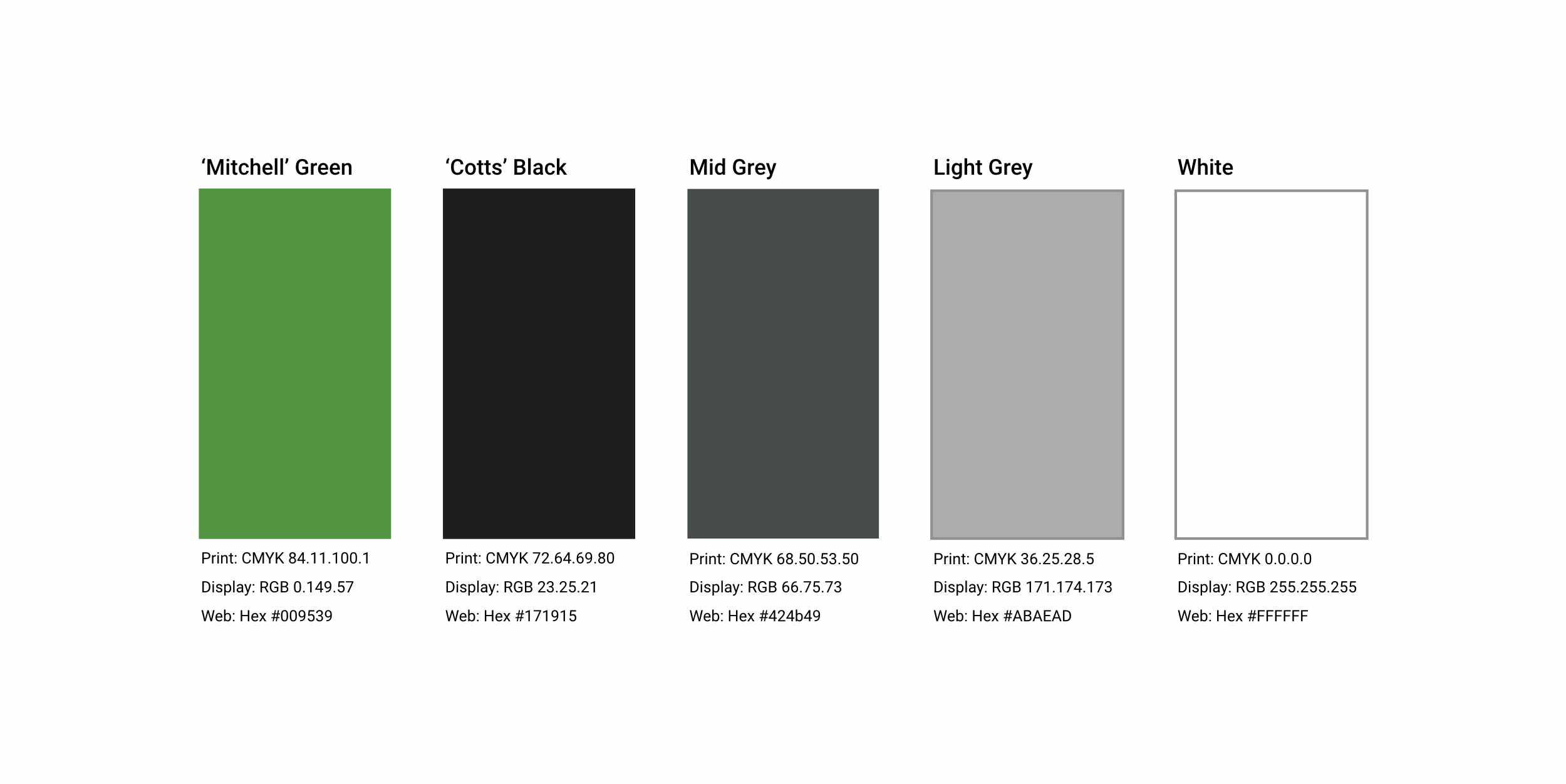
An emphasis for the new logo needed to incorporate the remanufacture part of MCT's core business,
currently represented by the looped arrow inside the 'egg', as well as update the brand colours, and
to consider the Reman Ltd tag line as this was too small, especially when scaled down.
The new logo needed to incorporate the following attributes:
- • A green element to reflect the remanufacturing process.
- • Must include 'MCT' or 'MCT Reman'.
- • Reference to the Reman 'cycle' itself.
- • Have a modern/contemporary feel to it.
The Design
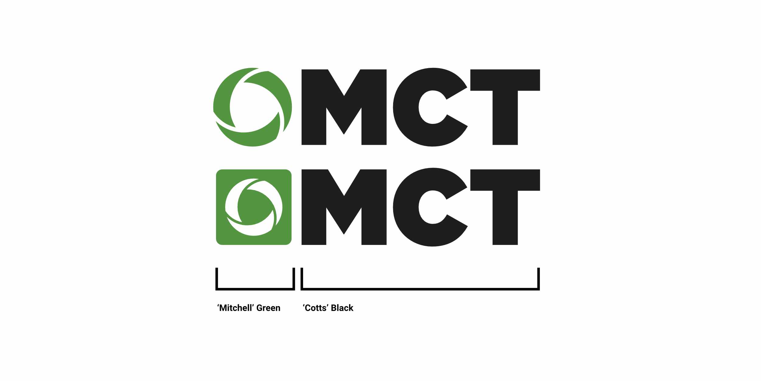
The final logo design can been seen below. The design is bold, simple and relevant.
Two versions of the logo were created, where the logo icon could be used in different
situations, whilst remained consistent in the overall look and feel.