Friday, 22 May 2020
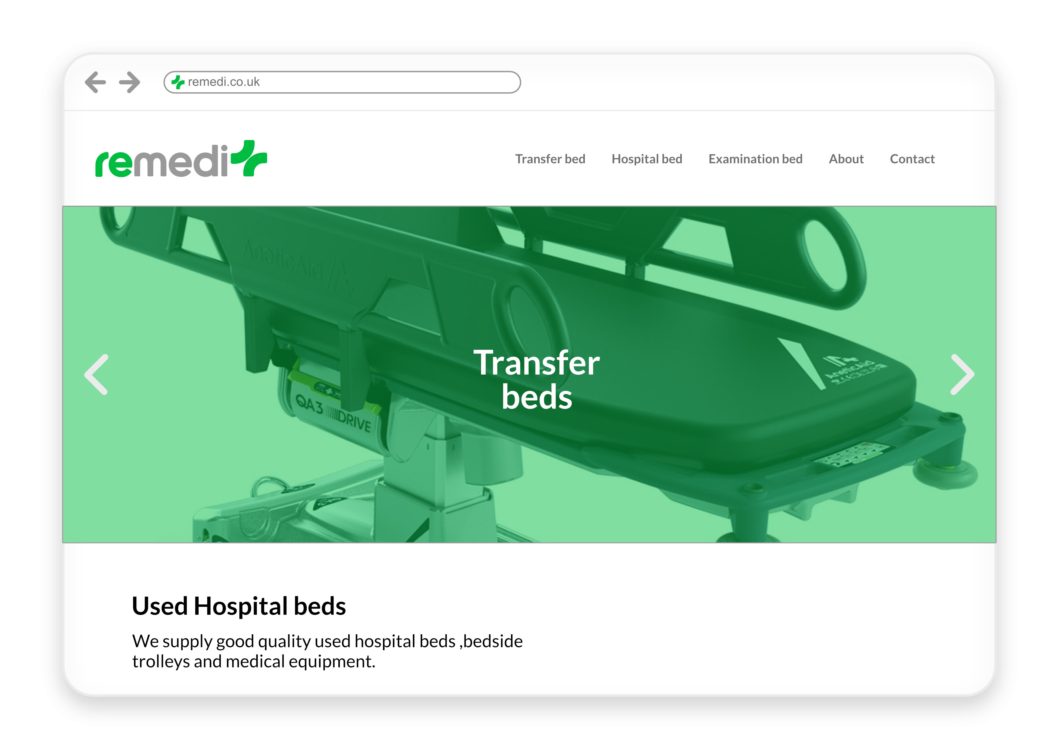
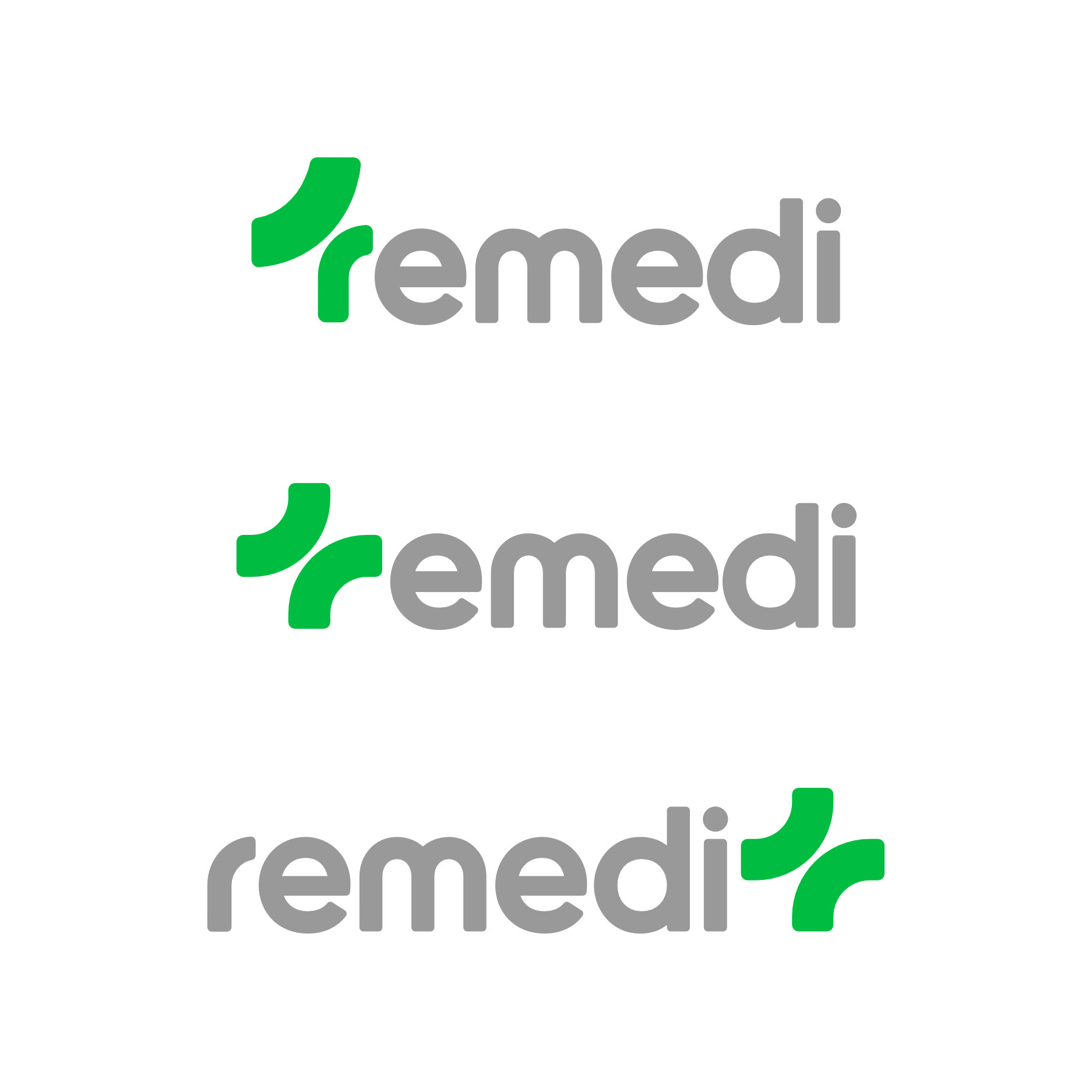
The final logo lockup is simple and appropriate, with the first part of the brand name highlighting the recycled part of the buisiness.
By keeping the brand name in lowercase letters it refrains from being too agressive in nature, providing a sense of calm and empathy.
The final logo lockup is simple and appropriate, with the first part of the brand name highlighting the recycled part of the buisiness.
By keeping the brand name in lowercase letters it refrains from being too agressive in nature, providing a sense of calm and empathy.
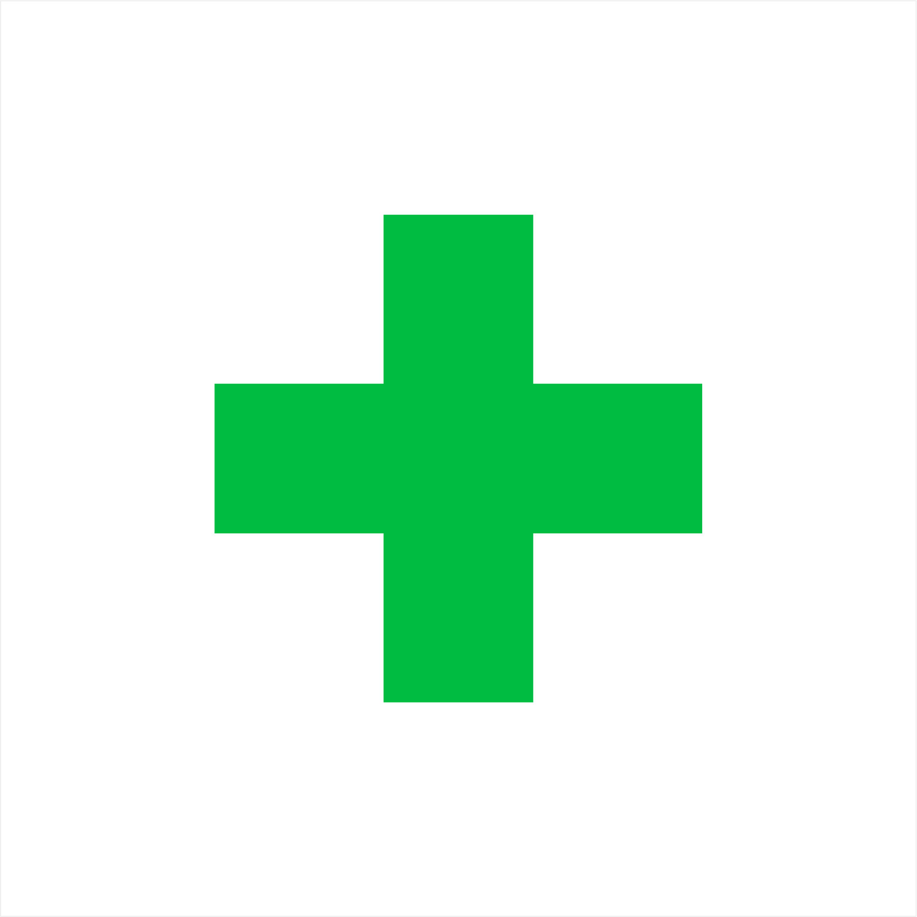
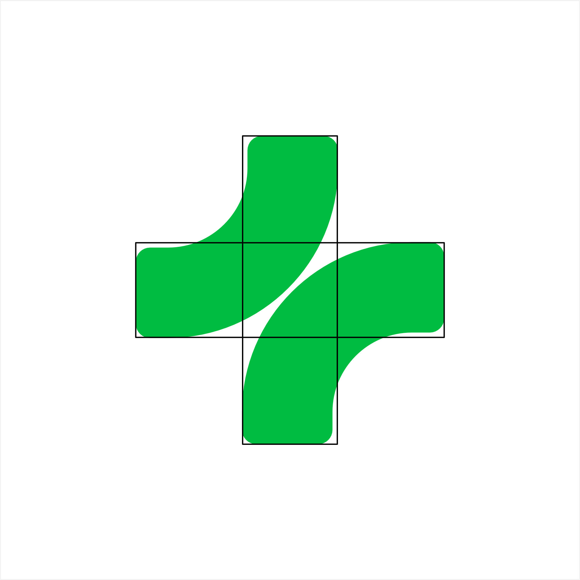
A strong rotational logo icon to emphasise the medical aspect of the business.
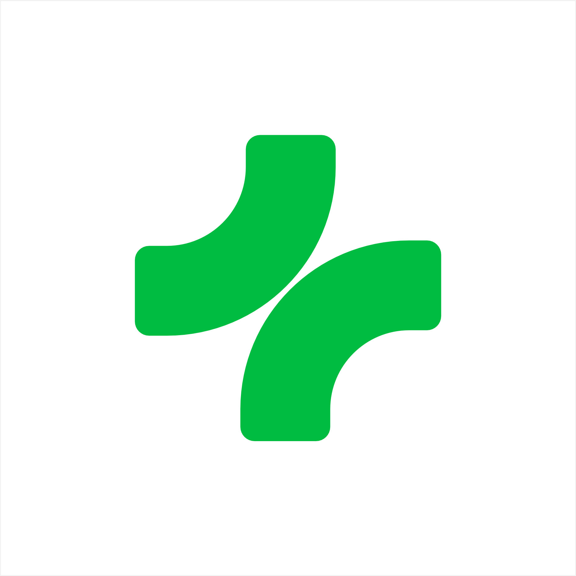
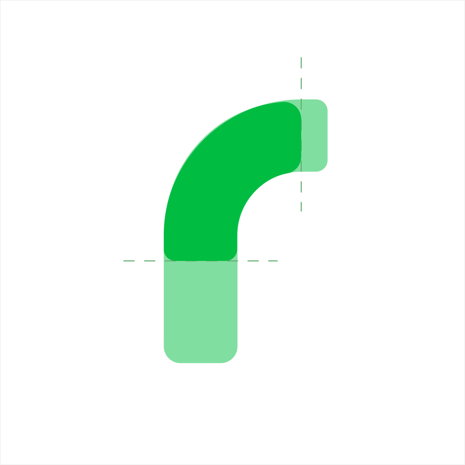
Creating the logo icon to sit with the brand name, breaking down the 'r' in 'remedi'.