Thanks for visiting.
Hope you've seen something you like.
Thanks for visiting.
Hope you've seen something you like.
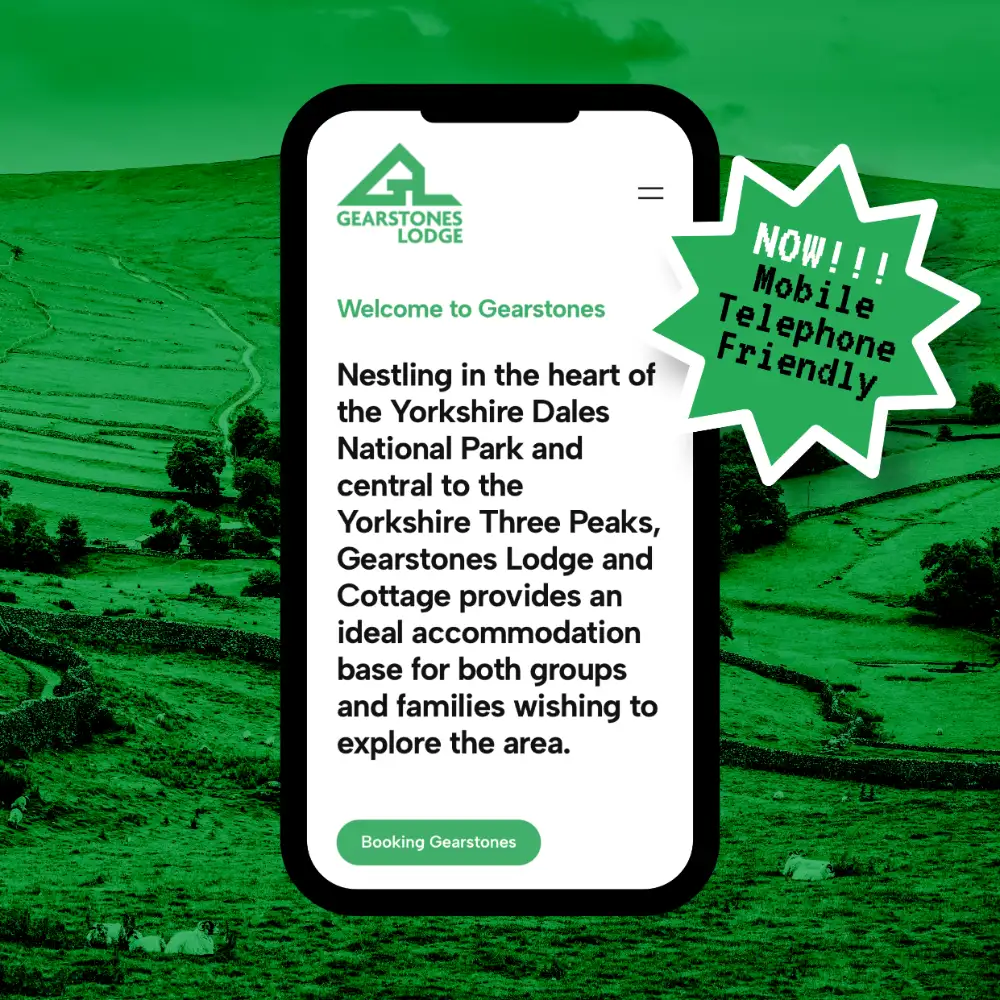
Nestling in the heart of the Yorkshire Dales National Park and central to the Yorkshire Three Peaks, Gearstones Lodge and Cottage provides an ideal accommodation base for both groups and families wishing to explore the area.
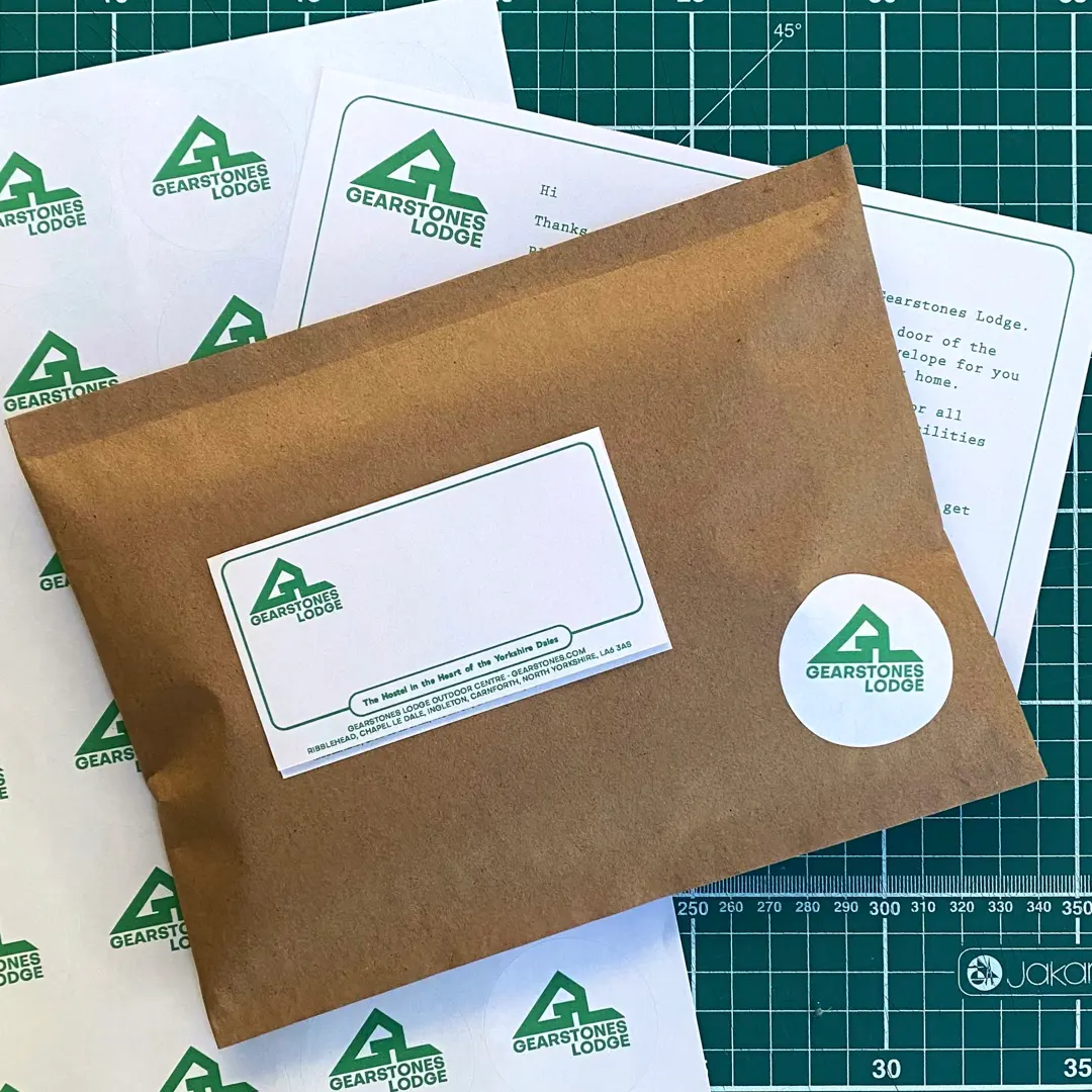
As a trustee and committee member of this Mirfield based charity, this project was a self-initiated rebrand to modernise the visual identity and help revitalise its online presence.
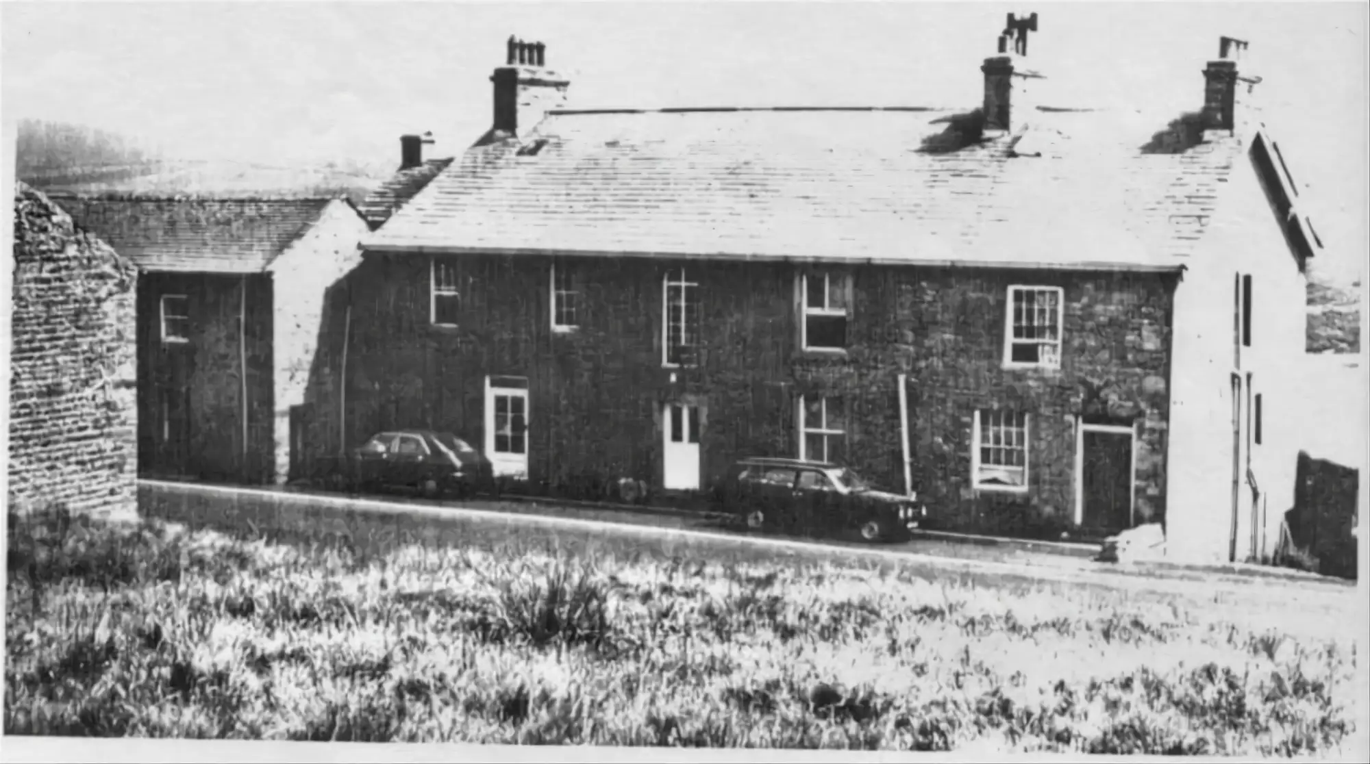
Formerly an old shooting lodge, the building went through a prolonged period of decline until being rescued by the people of Mirfield under the auspices of Gearstones Lodge Charitable Trust. The trust, through the generosity of Mirfield, was able to purchase the property in 1972.
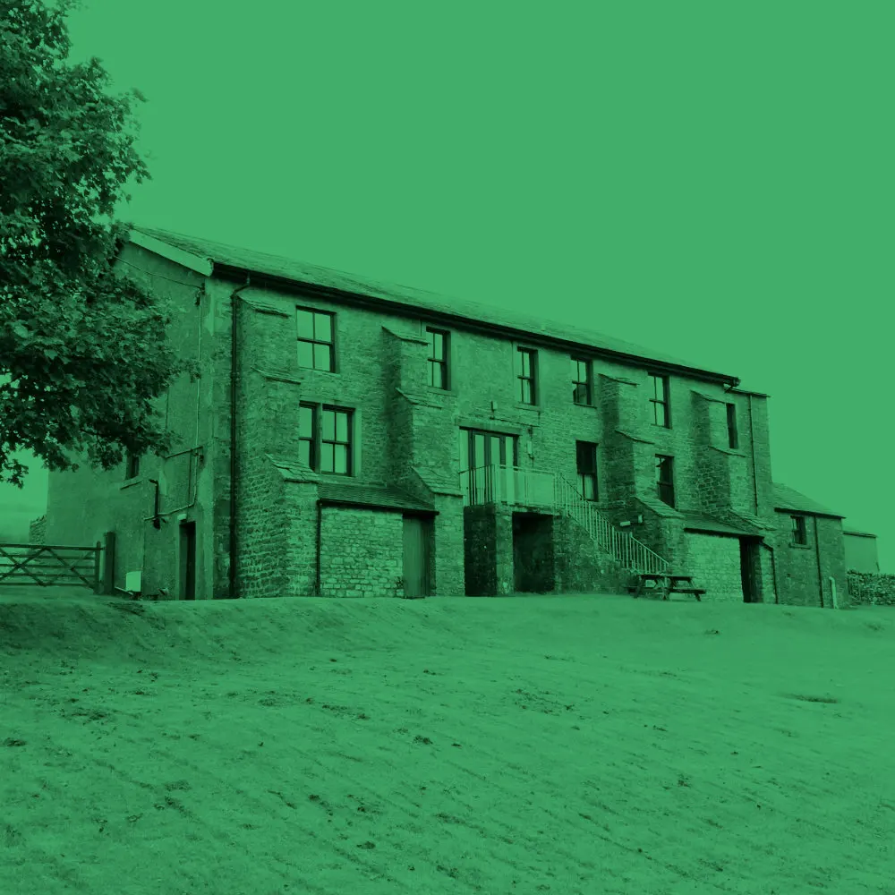
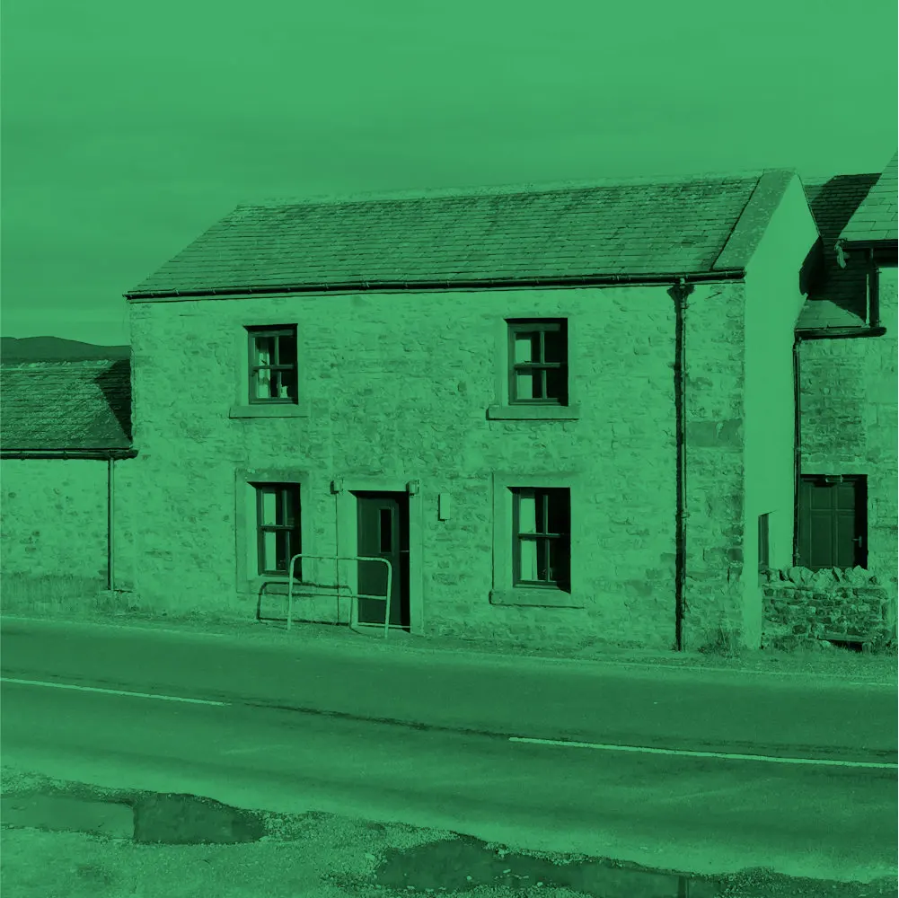
The converted barn, which adjoins the Lodge, is decorated in traditional Dales style and provides self-catering accommodation for up to six people, suitable for families or small groups.
The buildings have since been converted into a comfortable and spacious self-catering accommodation.
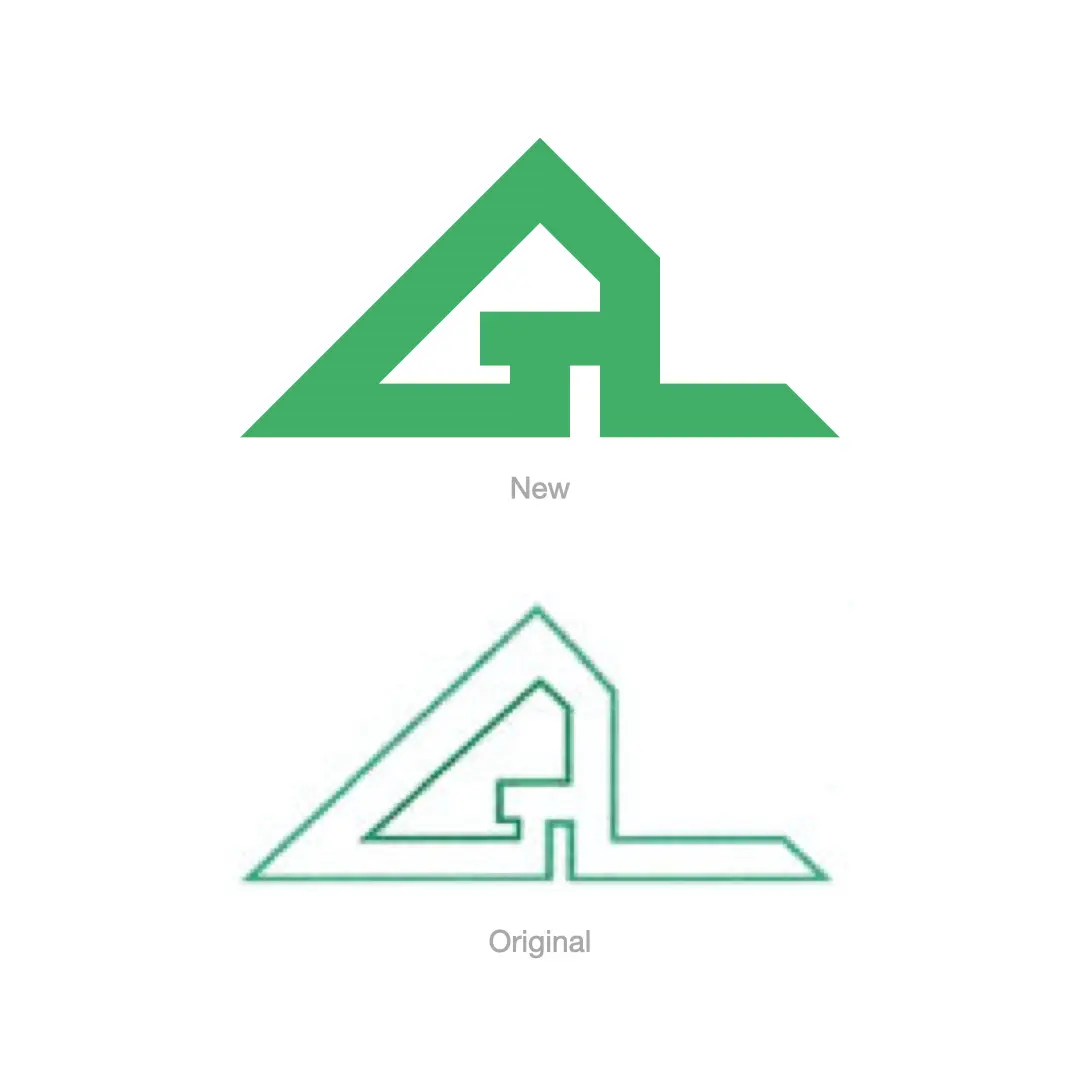
I had been toying with the idea to update the Lodge branding for a while, and although I loved the original design for its visual simplicity, I wanted to strengthen the identity with a bolder colour and more impactful logo.
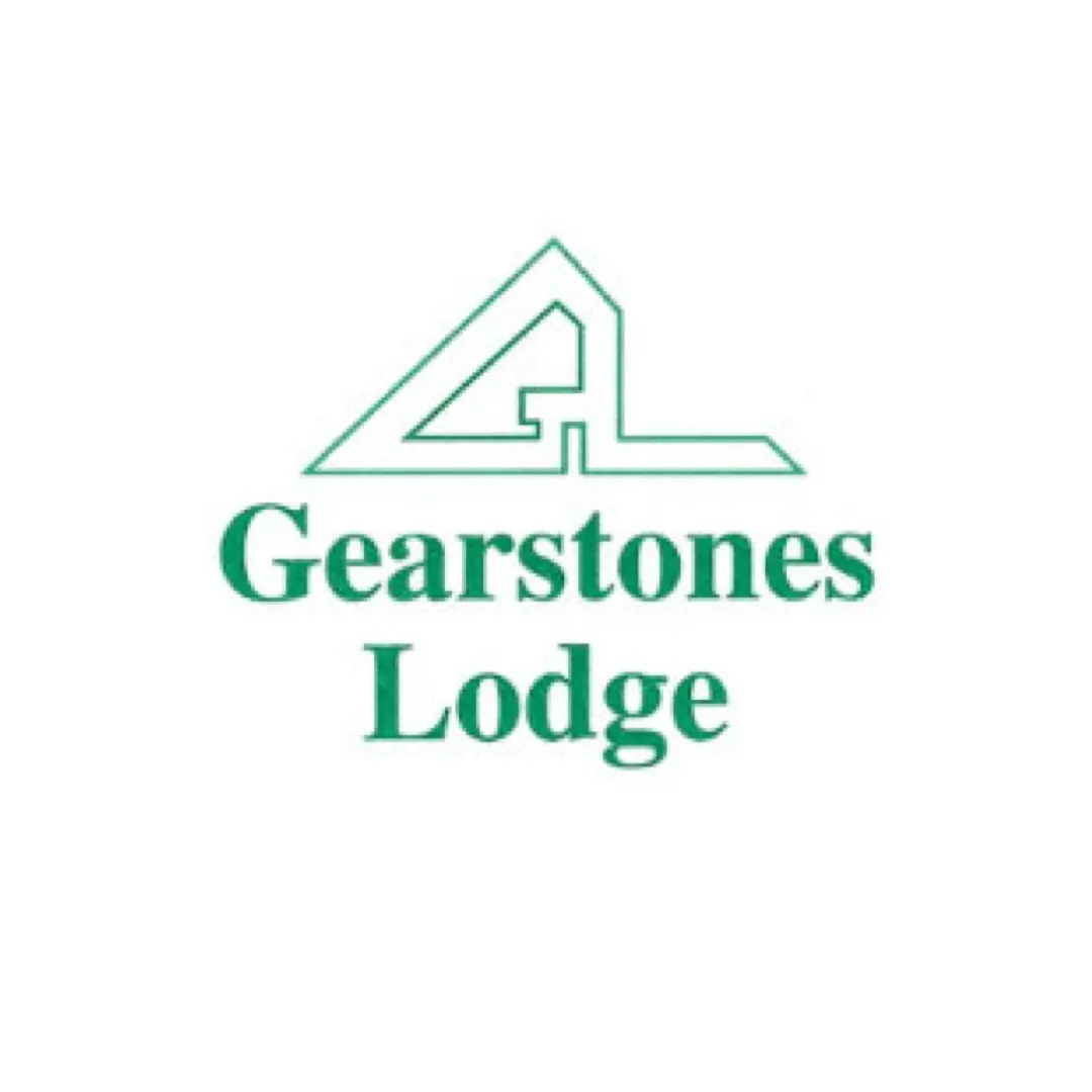
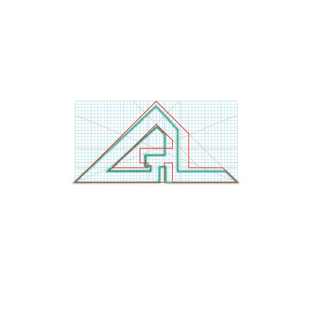
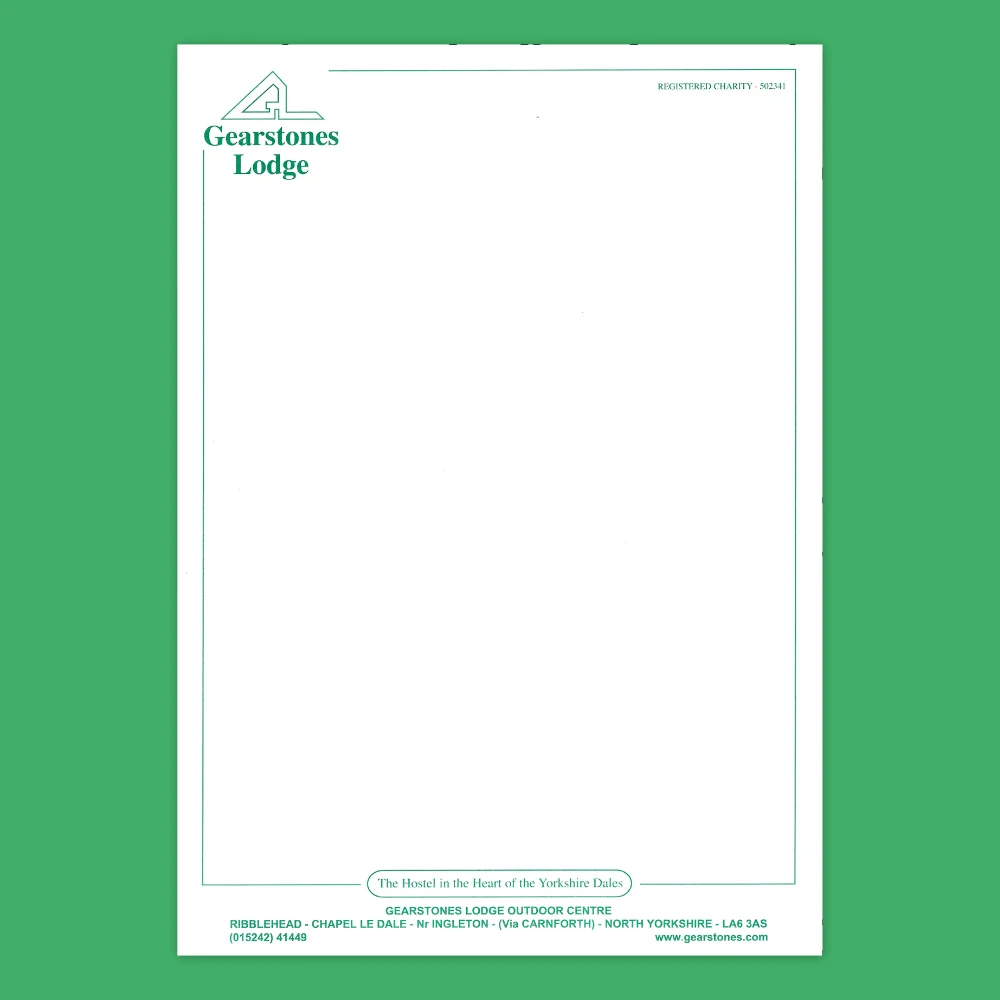
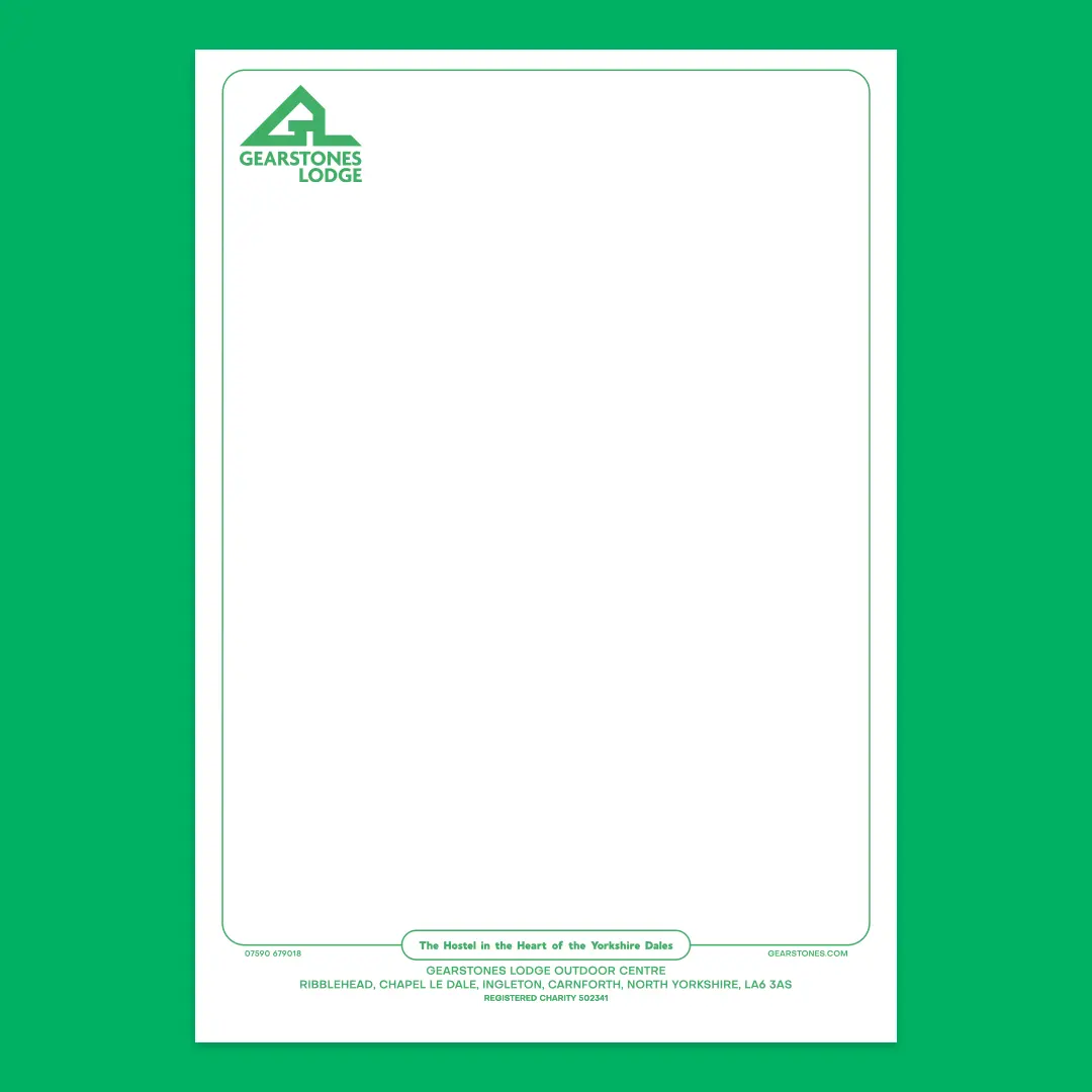
As you can see, the original logo had a few symmetry and alignment issues affecting the visual balance. The updated identity has been created to honour the original logo mark, and give it a greater presence on the page.
Using a basis grid for alignment helped in reworking the logo for symmetry and balance.