To design and develop a new primary logo and additional brand assets for Activate Accident Repair.
The logo's look & feel needs to capture the following aspects: pace, professionalism, warm, clean, fresh, modern and non-generic.
Additional essential logo requirements are: scalability, clarity, simplicity, differentiate, appropriate, informative and trend-less.
Initial sketch drawn whilst commuting to Leeds.
Never dismiss that first idea!
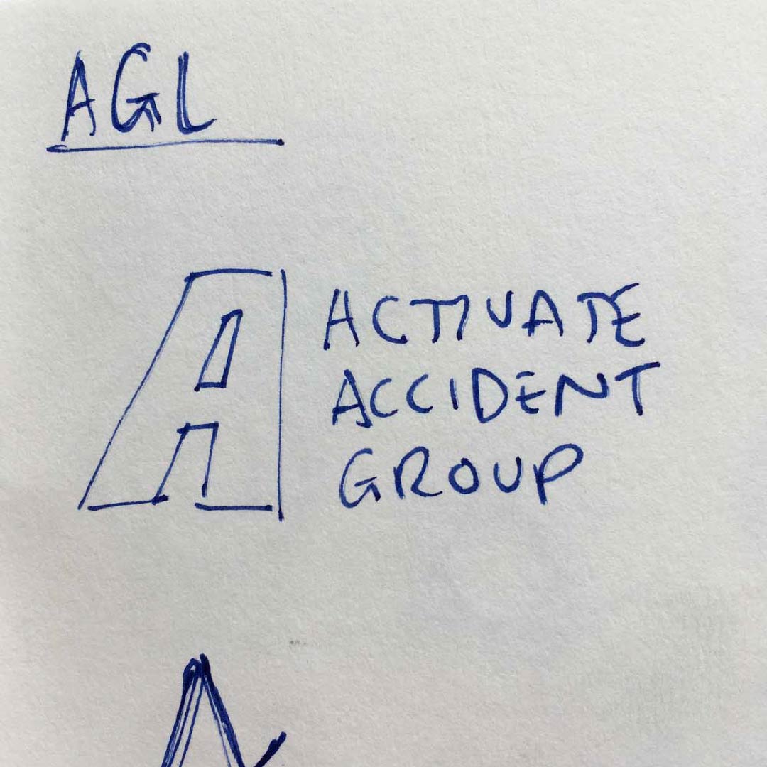
A multitude of ideas were generated however the final design fell back to the original sketch. Sometimes the first idea is the one that resonates best.
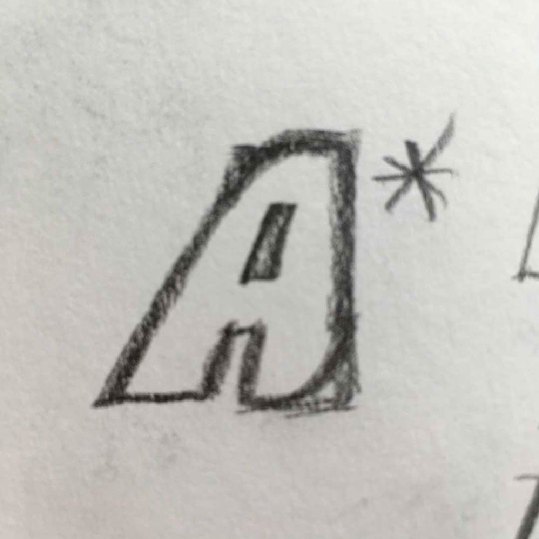
The final rebrand is bold, simple and relevant.
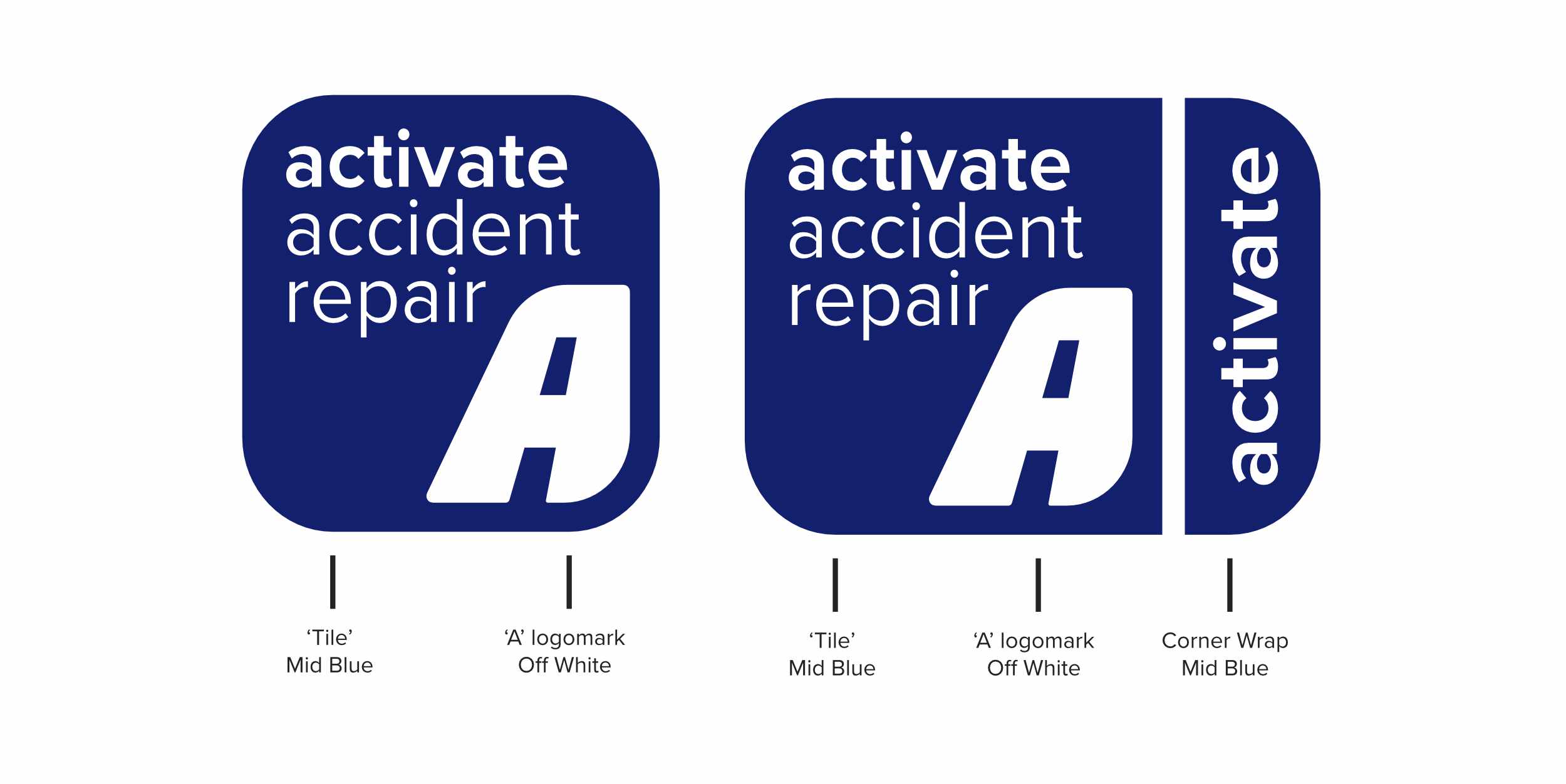
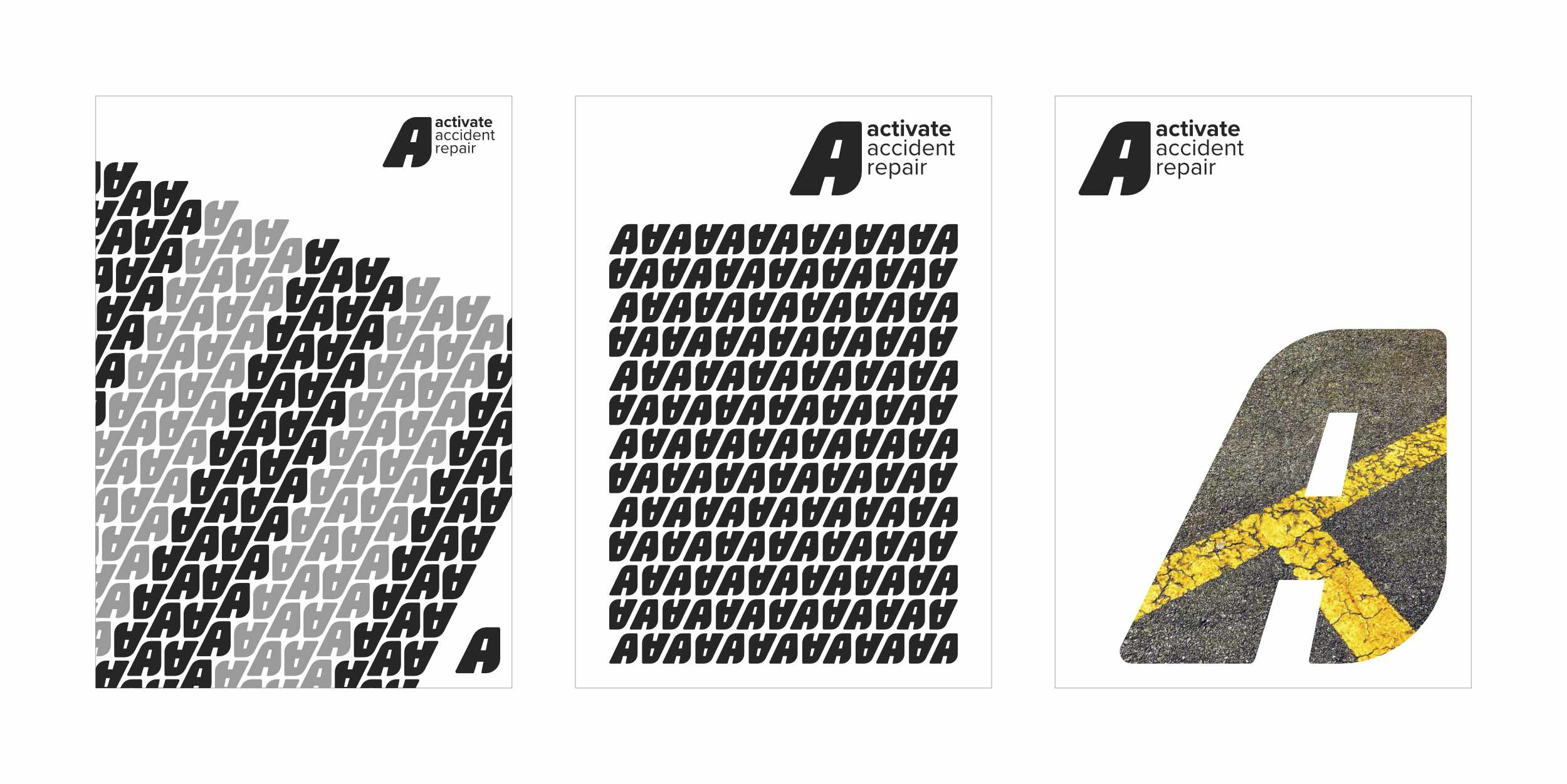
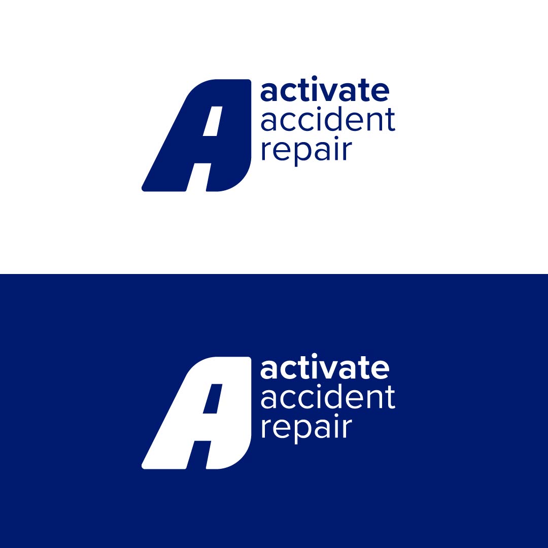
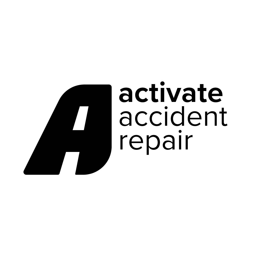
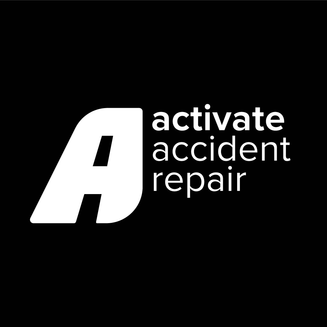
Two versions of the logo were created, where the logo icon could be used in different situations, but remain consistent in its overall look.
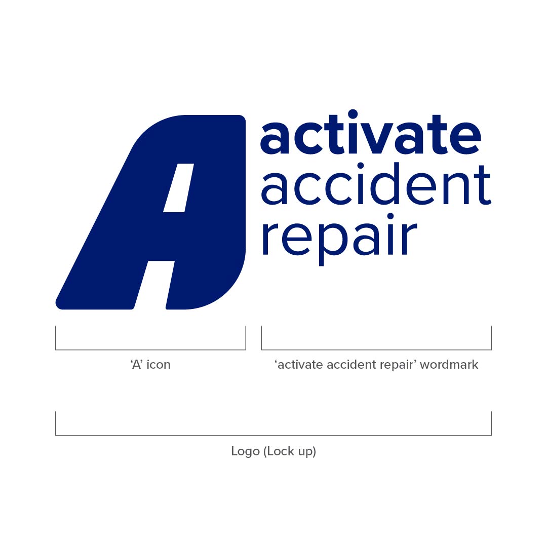
The master logo (lock up) consists of the ‘A’ icon in conjuction with the ‘activate accident repair’ lowercase wordmark.
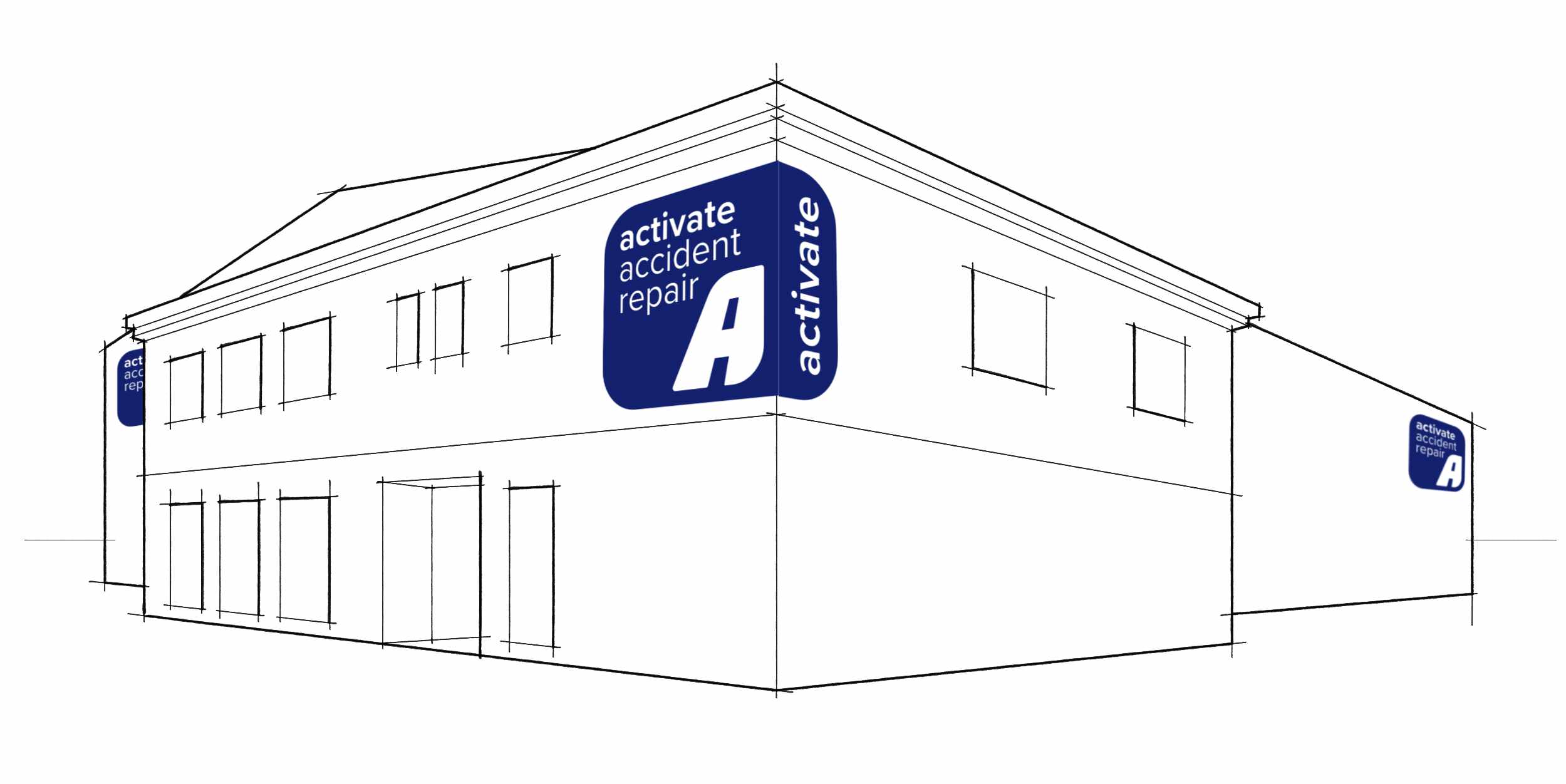
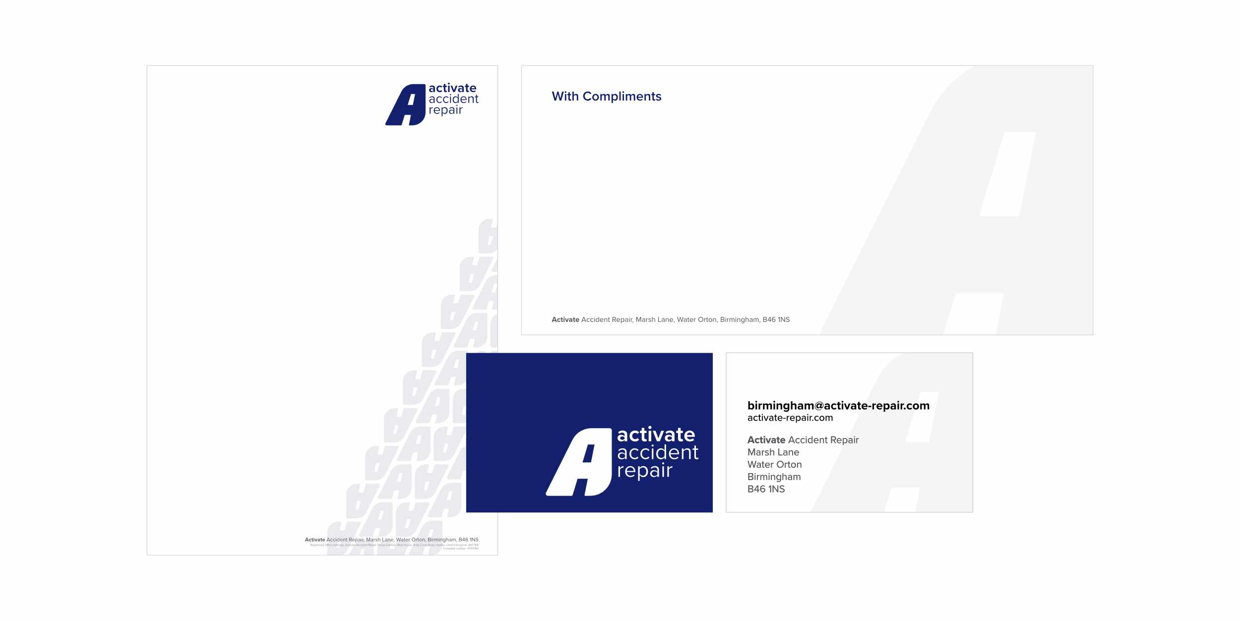
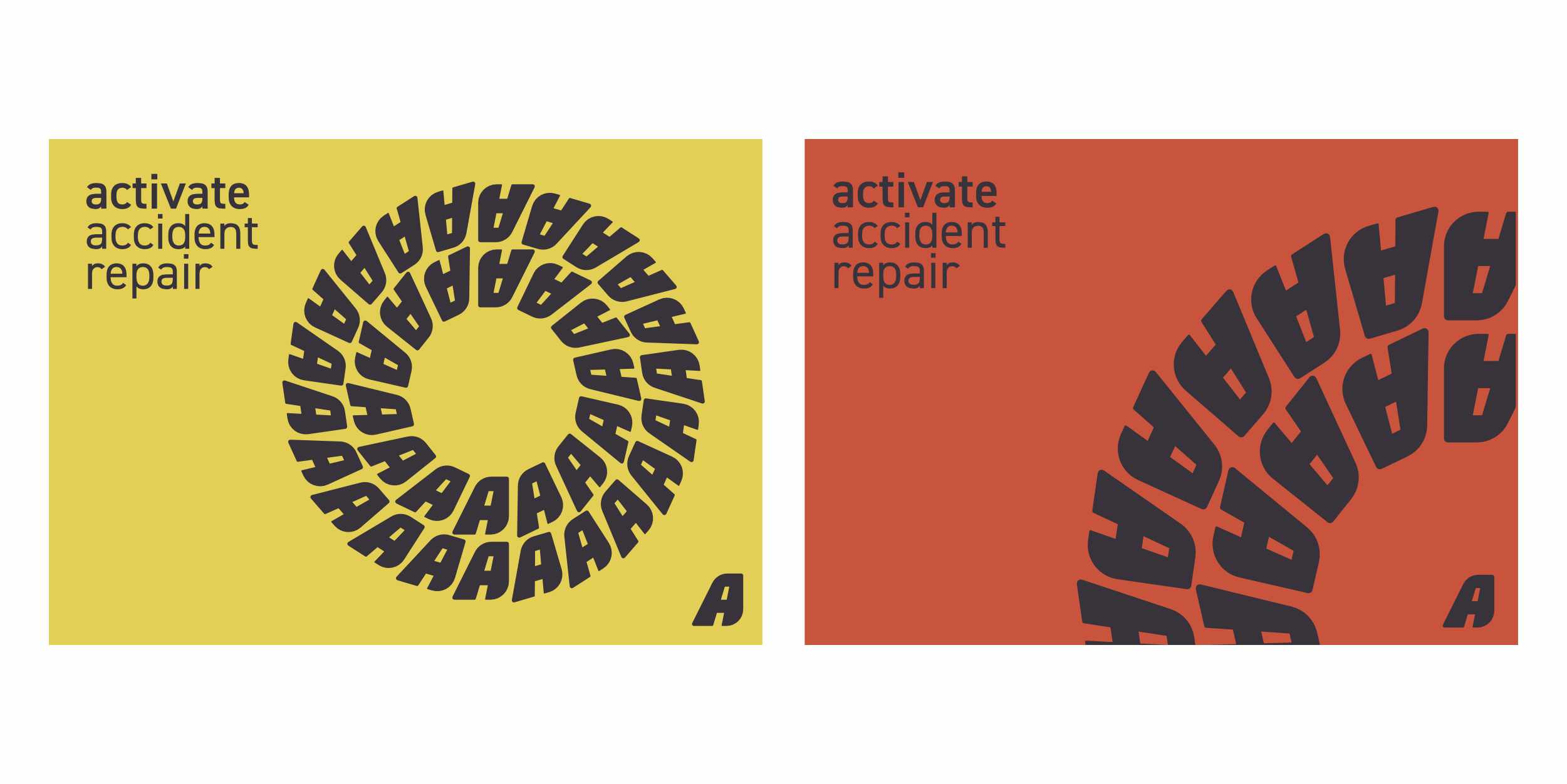
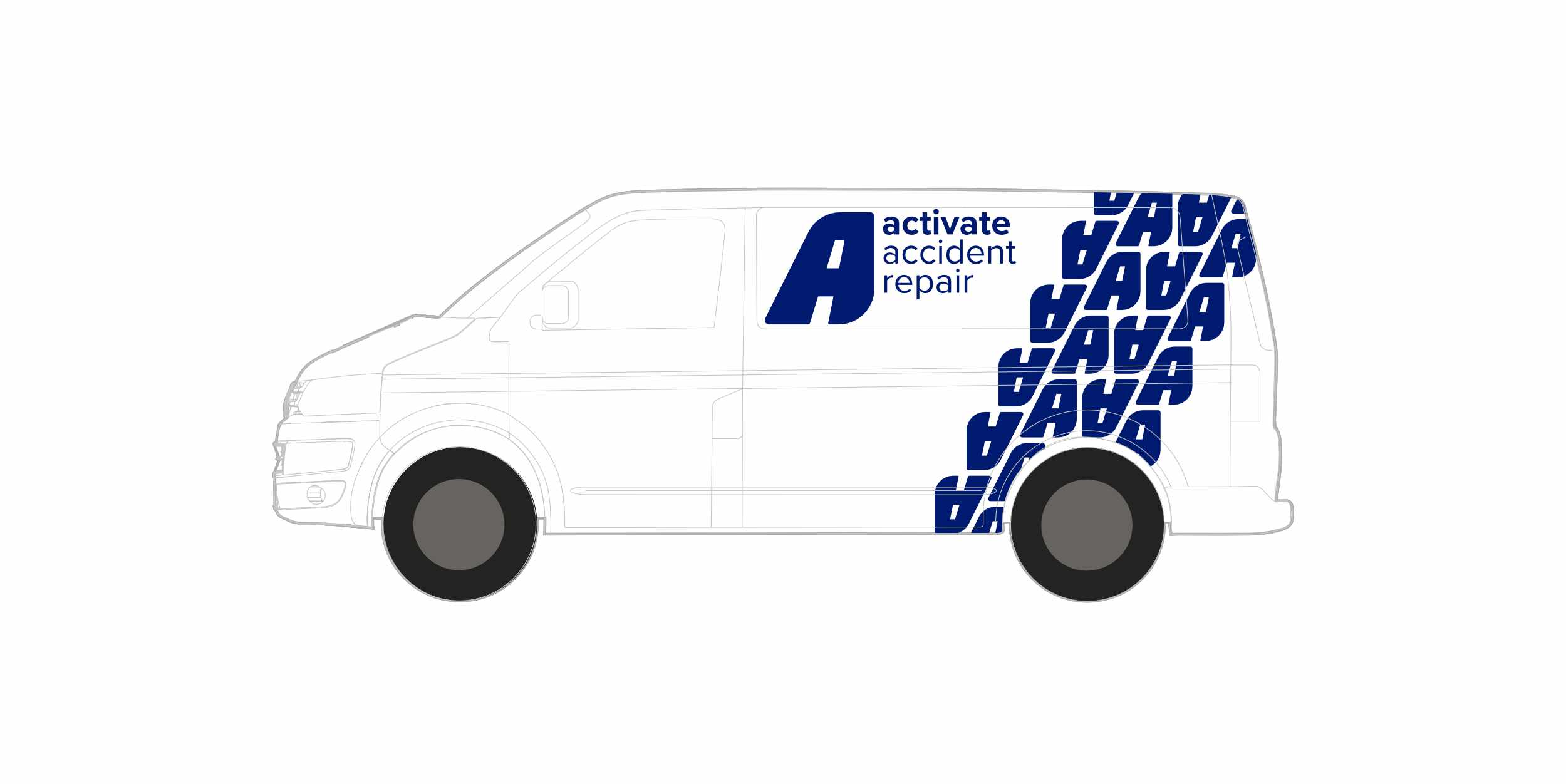
Thoughts on options for vehicle livery and additional brand collateral.
